
CSS in 2026: The Most Exciting Features Shaping Modern Web Design
Discover the most powerful CSS features of 2026, including nesting, container queries, scroll-driven animations, anchor positioning, and more.
The CSS category follows how stylesheets are changing and what that means for the way you build layouts, components, and animations. Many features that once needed JavaScript or a preprocessor now work in plain CSS. The articles here explain several of them: container queries for components that adapt to the space they sit in, native nesting, the :has() selector, @scope, cascade layers, subgrid, and anchor positioning. Each piece looks at what the feature does, where it helps in real projects, and how it fits with established tools such as Grid and media queries. Animation articles cover transforms, scroll-driven animations, and how to keep motion smooth without hurting page performance. Browser support gets attention too, including the Interop project, the joint effort by browser makers to make features behave the same in Chrome, Safari, and Firefox. These articles help you judge when a new property is safe to use in production. For quick reference, conversion tables such as PX to REM help you set font sizes and spacing that scale with the reader's browser settings, which also makes pages easier to read for people who use larger text. Front-end developers, theme builders, and site owners who edit their own styles will find practical material here, and the trend articles are a quick way to catch up on modern CSS.
Discover the most powerful CSS features of 2026, including nesting, container queries, scroll-driven animations, anchor positioning, and more.
Discover 4 essential CSS features every front-end developer must know in 2026: nesting, :has(), cascade layers, and @scope — all production-ready today.

Master advanced CSS animation techniques in 2026. Learn performance optimization, 3D transforms, scroll-driven animations, and cutting-edge CSS features for modern web development.

Explore how Interop 2026 is revolutionizing web development through universal browser standards, improved CSS capabilities, and enhanced cross-platform compatibility.

Discover the revolutionary CSS features of 2026 including container queries, subgrid, native nesting, advanced color management, and cascade layers transforming web development.
Discover the latest CSS developments in 2026, including container queries, cascade layers, native nesting, and advanced animation features transforming web development.
Discover the revolutionary CSS features coming in 2025-2026, including container queries, native nesting, and advanced color functions that are transforming web development.
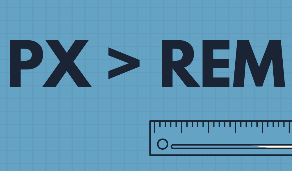
REM unit is a mixture of px and em. REM sets the size relative to the root font size of the page.…